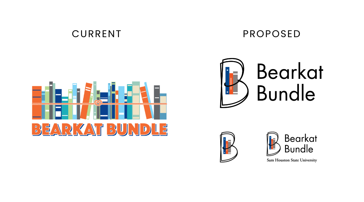
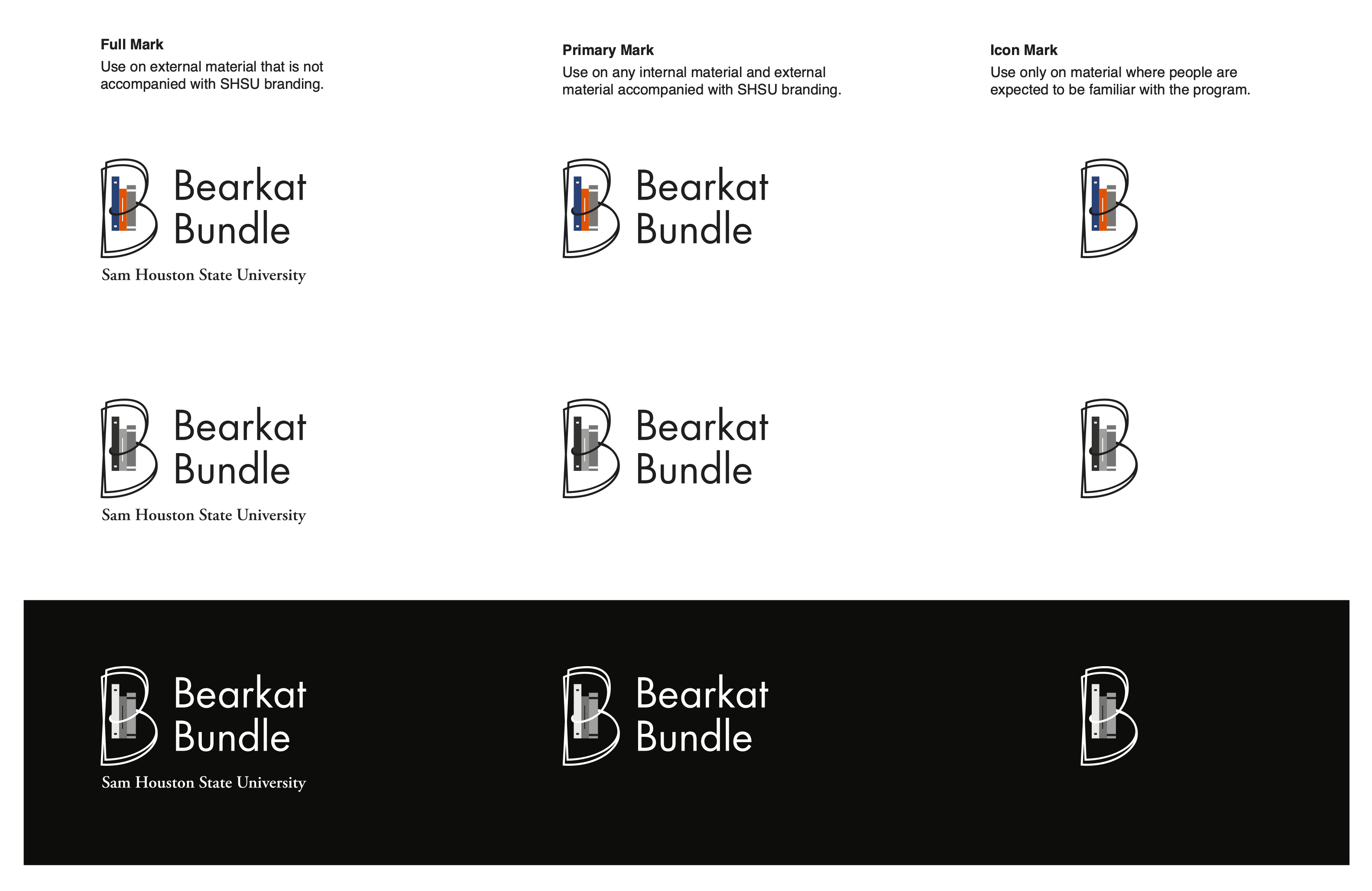
Bearkat Bundle Program Mark
The Bearkat Bundle is an inclusive access program, offering students affordable, flat-rate access to required course materials. When tasked with redesigning the visual identity for the program, I sought to correct design issues in the existing logo while honoring the initiative’s student-first mission.
This conceptual redesign was developed during my time at SHSU to explore how the Bearkat Bundle identity could better reflect the initiative’s mission and student experience. While not adopted, it demonstrates my process in evaluating and reimagining existing assets with clarity, meaning, and scalability.
Why Change?
The existing logo presented a number of visual challenges that made it difficult to scale and align with the student-focused messaging of the program.
- Book quantity may unintentionally suggest an unrealistic course load, which could be refined for better clarity.
- Complex compositions can present challenges for logo clarity and reproduction across sizes
- Books appear loosely stacked and leaning, despite being bound by a rope.
- Some elements suggest a shelf rather than a portable bundle, which may dilute the visual metaphor.
- A broad color palette adds vibrancy, but may impact focus and scalability at smaller sizes.
- Fine details like the rope don’t hold up at small sizes.
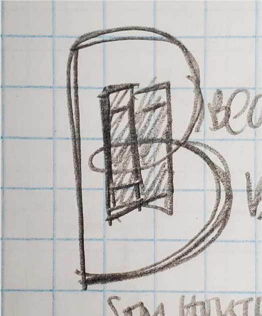
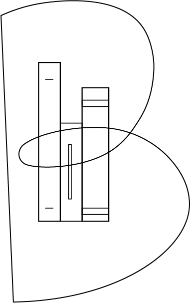
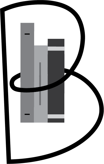
The Solution
In 2021, I proposed a modern, minimal logo built for clarity, scalability, and meaning:
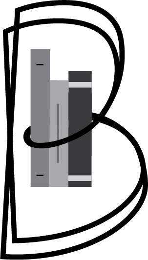
- Double-layered B: Stylized to suggest both “Bearkat” and “Bundle.”
- Page-turn symbolism: The rounded forms of the Bs curve like flipping pages.
- 3 simple books: Positioned between the arches of the B, directly referencing the realistic bundle size.
- Circular motion: The interlocking Bs form a loop, reinforcing the concept of inclusivity and continuity—foundations of the program’s value to students.
Key Takeaways
Though not officially adopted, the process demonstrates my approach to brand refinement within established systems.
- Visual honesty matters: logos shape perception and trust.
- Even great design solutions may not gain traction without a supportive culture.
- Simplicity, clarity, and symbolism make marks memorable and scalable.