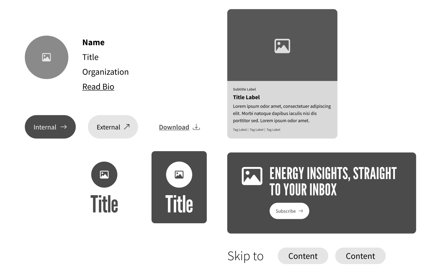
In higher education and other complex content ecosystems, one of the biggest challenges is enabling non-technical staff to keep content accurate and engaging—without relying on developers.
Using Modern Campus CMS, I led a modular content initiative that transformed how content editors build and manage web pages—reducing technical bottlenecks and improving brand consistency at scale.
Our team had recently migrated to Modern Campus using a lift-and-shift approach, which preserved the existing structure and styling of our legacy site. While this expedited the transition, it also meant:
We needed a better solution—one that truly empowered non-technical users to own their content without sacrificing design, accessibility, or branding.
Design a snippet system within Modern Campus that made content editing fast, flexible, and brand-consistent.
Depending on the snippet and available resources, I switched between hands-on development and high-level oversight. As a Director of Online Marketing/User Experience, I served as:
The primary audience for this modular snippet system was internal, non-technical subject matter experts—staff responsible for maintaining academic, programmatic, or marketing content across the site.
Think of snippets as Lego pieces for your website—reusable content blocks like accordions, buttons, or cards. Instead of rebuilding each page from scratch, content creators can assemble layouts from pre-built, branded components that fit together seamlessly.
This shift to modular design means:
Brand colors replaced with grayscale for privacy.
As our library of snippets grew, we identified opportunities to break out of rigid templates and give editors more control—without sacrificing structure or standards.
We evolved snippets into stackable building blocks, enabling:
Brand colors replaced with grayscale for privacy.
Instead of using a fixed template, we can mix and match snippets
Brand colors and elements replaced with grayscale for privacy.
Every snippet we developed adhered to WCAG best practices—designed to be usable for everyone, especially on mobile.
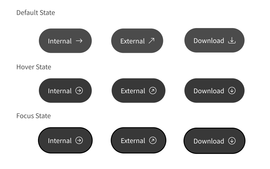
To reduce confusion—especially for users on mobile devices or those with visual impairments—we introduced visual indicators directly into the button design. Each icon communicates what will happen before a user clicks:
These simple symbols give users control over their experience—helping them avoid surprises like unintentionally opening a new window or downloading a file on limited mobile data.
We also built in hover states and subtle animations that reinforce the button’s behavior, providing extra visual feedback that supports accessibility best practices (e.g., for users with low vision or motor impairments).
In short, the Button Snippet made each interaction predictable, accessible, and on-brand—all with zero coding required from content editors.
Brand colors replaced with grayscale for privacy.
A full redesign or brand refresh no longer means hundreds of manual updates—just update the snippet, and changes cascade everywhere.
Want More? Get Design System Insights
An inside look at my design approach and strategic decisions made at a former organization. Password required – email jrgorbett@yahoo.com or call 832-687-3515.