Project Highlights
Brand-Centric Exploration
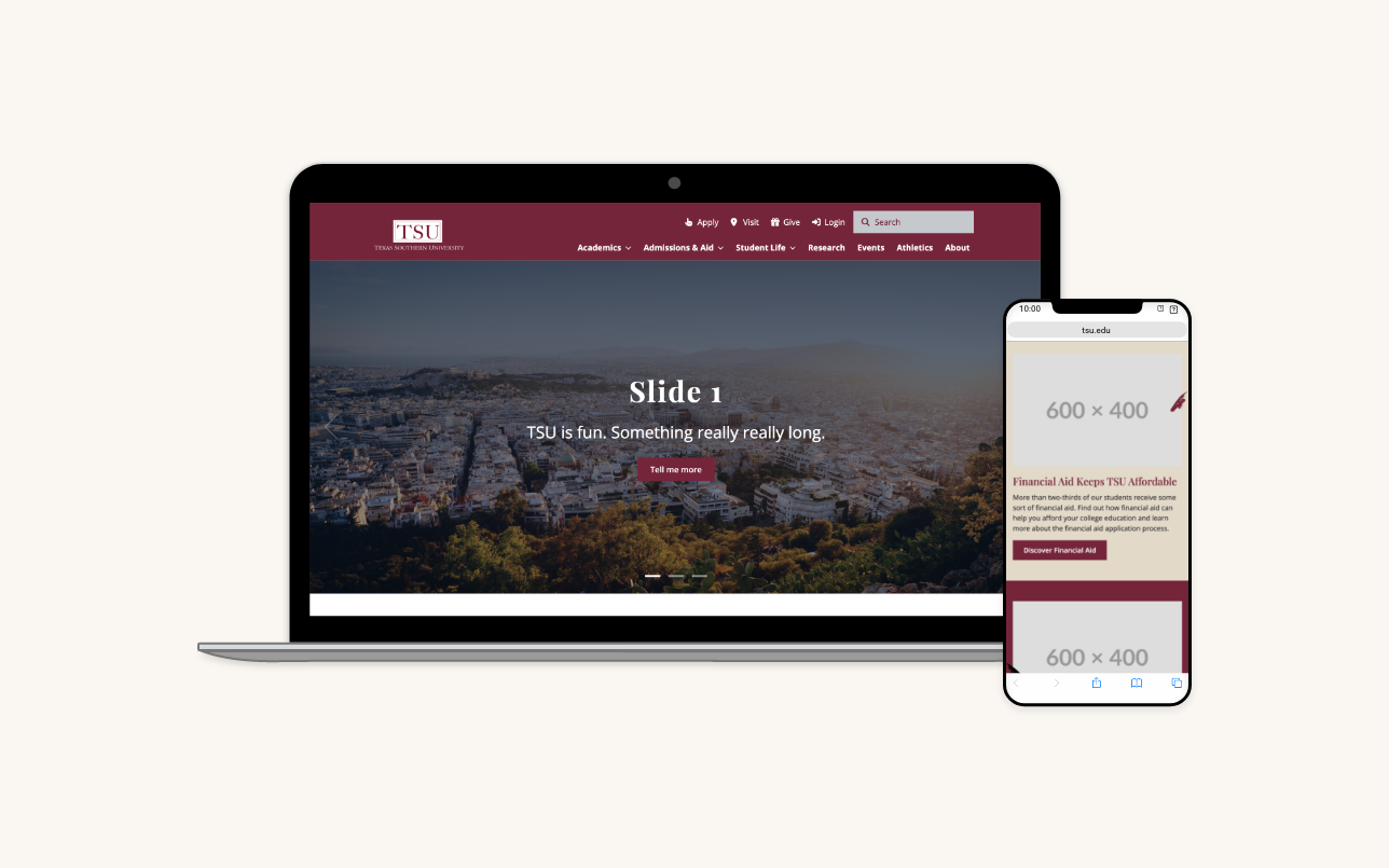
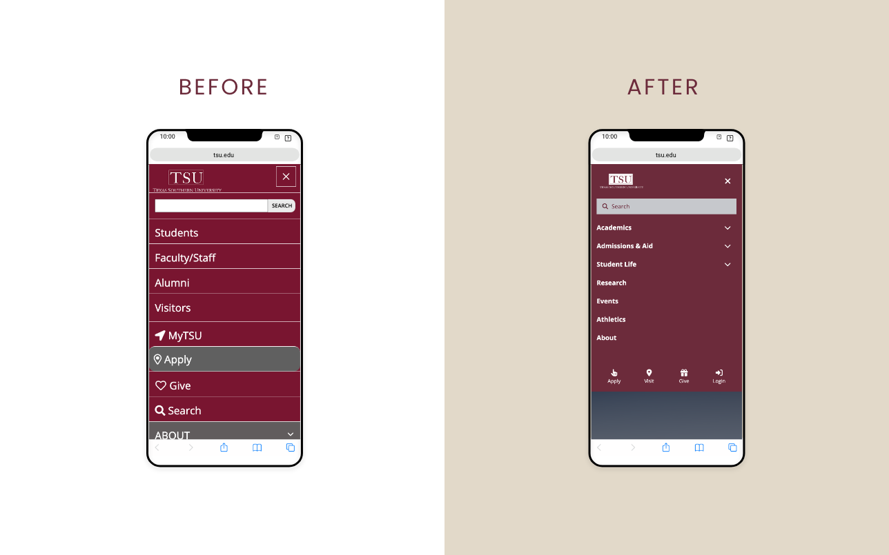
From the beginning, I knew this project could be more than just a modern design system—it was an opportunity to reflect the university's soul in the smallest details. Rather than jump straight into components, I led an exploratory phase with the Marketing and Communications team, where we built and refined mood boards together.
We pulled from what made the university feel alive: the movement in the murals, the pride in tradition, and the energy of HBCU culture. Each iteration of the mood board was presented for feedback, with open dialogue guiding refinements around tone, color, and emotion. This process surfaced core visual themes:
- Movement and rhythm, inspired by campus life and Black artistic expression
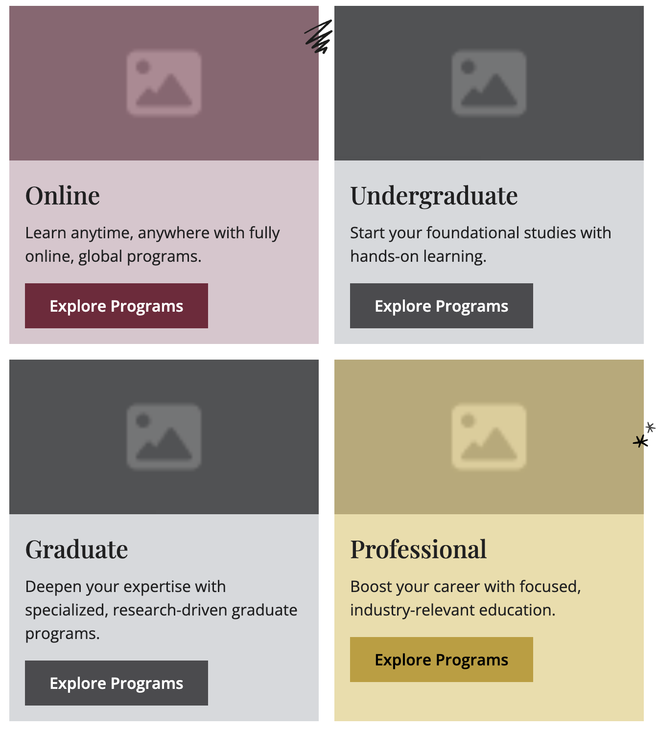
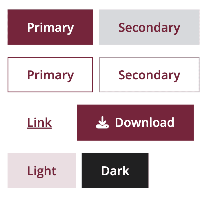
- Gold and beige accents, which added warmth and richness to the university's maroon
- Artistic layering and textures, honoring cultural storytelling found across campus
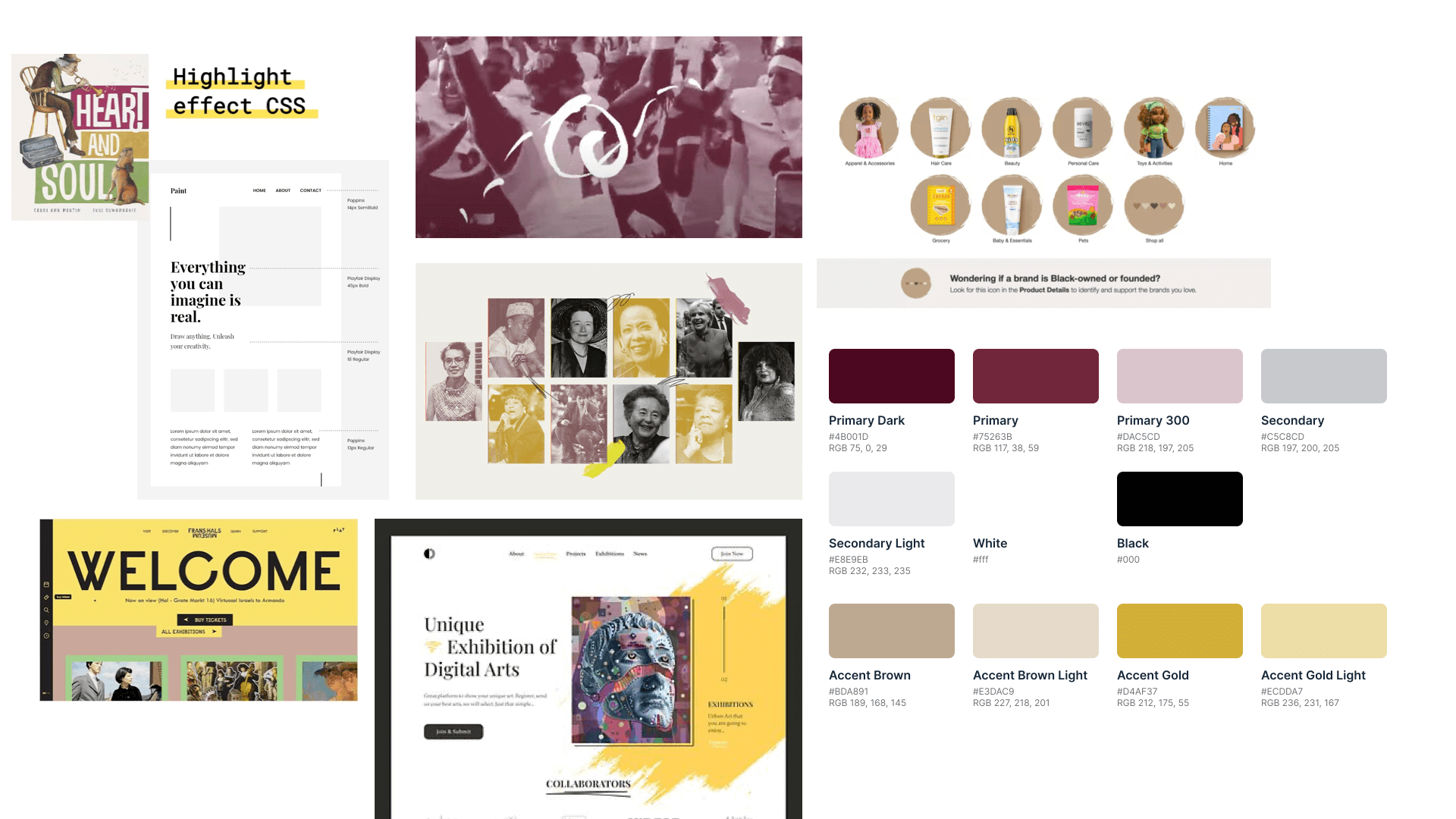
This wasn’t about decoration—it was about honoring identity. I believed that even micro elements in a design system could carry meaning. And by taking the time to get that right, we didn’t just build a system—we built a foundation that the university could see itself in.