A Warmer Visual Identity
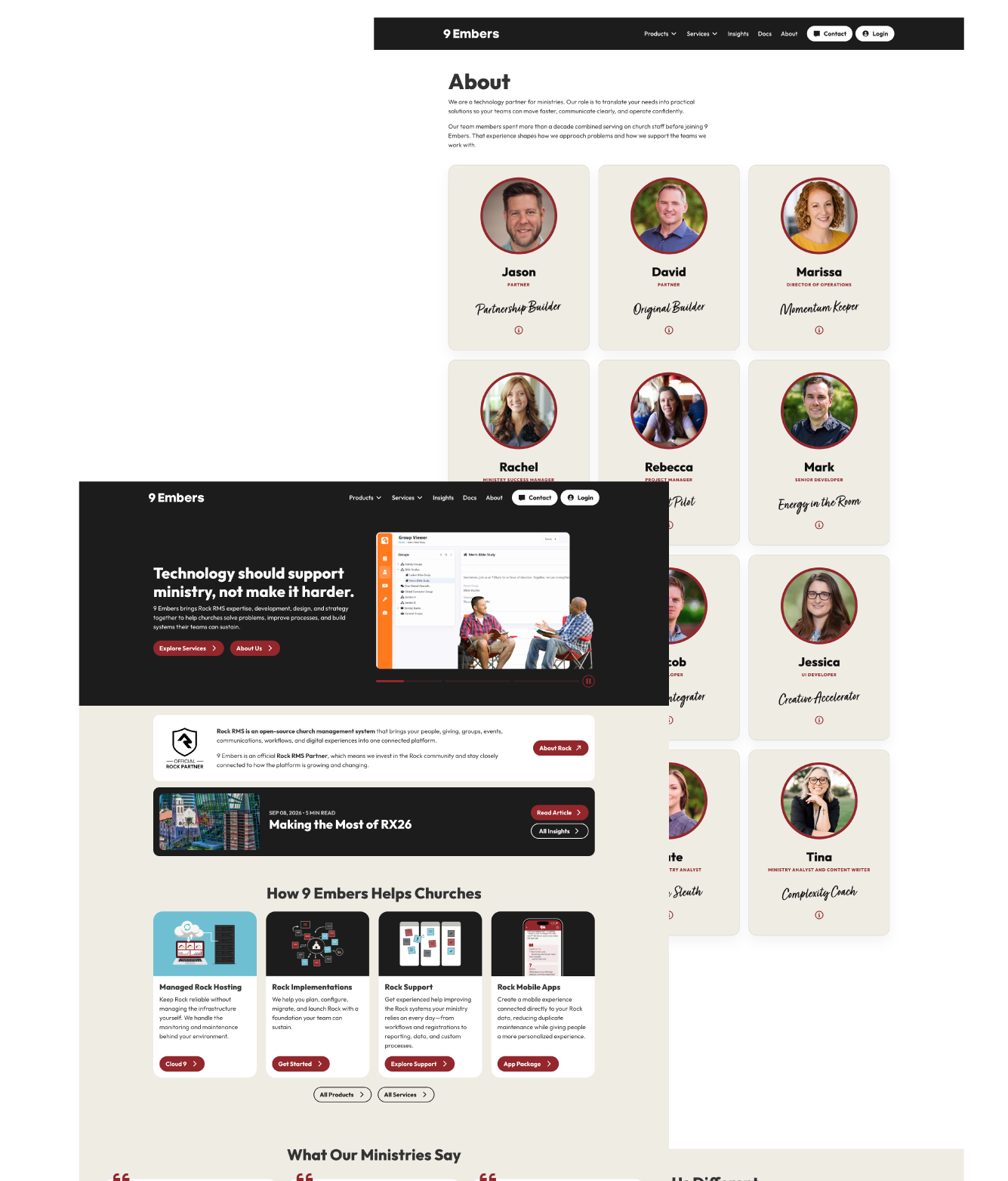
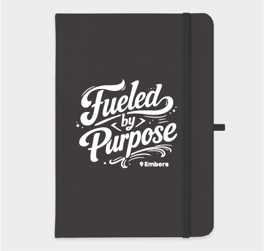
The visual identity was simplified around a clearer 9 Embers mark and a warmer palette. The original blue and gray system felt more technical and reserved. The new palette brings in red, bone, black, gray, and blue to create more warmth while still feeling grounded and professional. The updated logo also puts more emphasis on the 9, with the flame becoming a supporting part of the mark rather than the entire identity.
Before

After

Clarity Through the Website
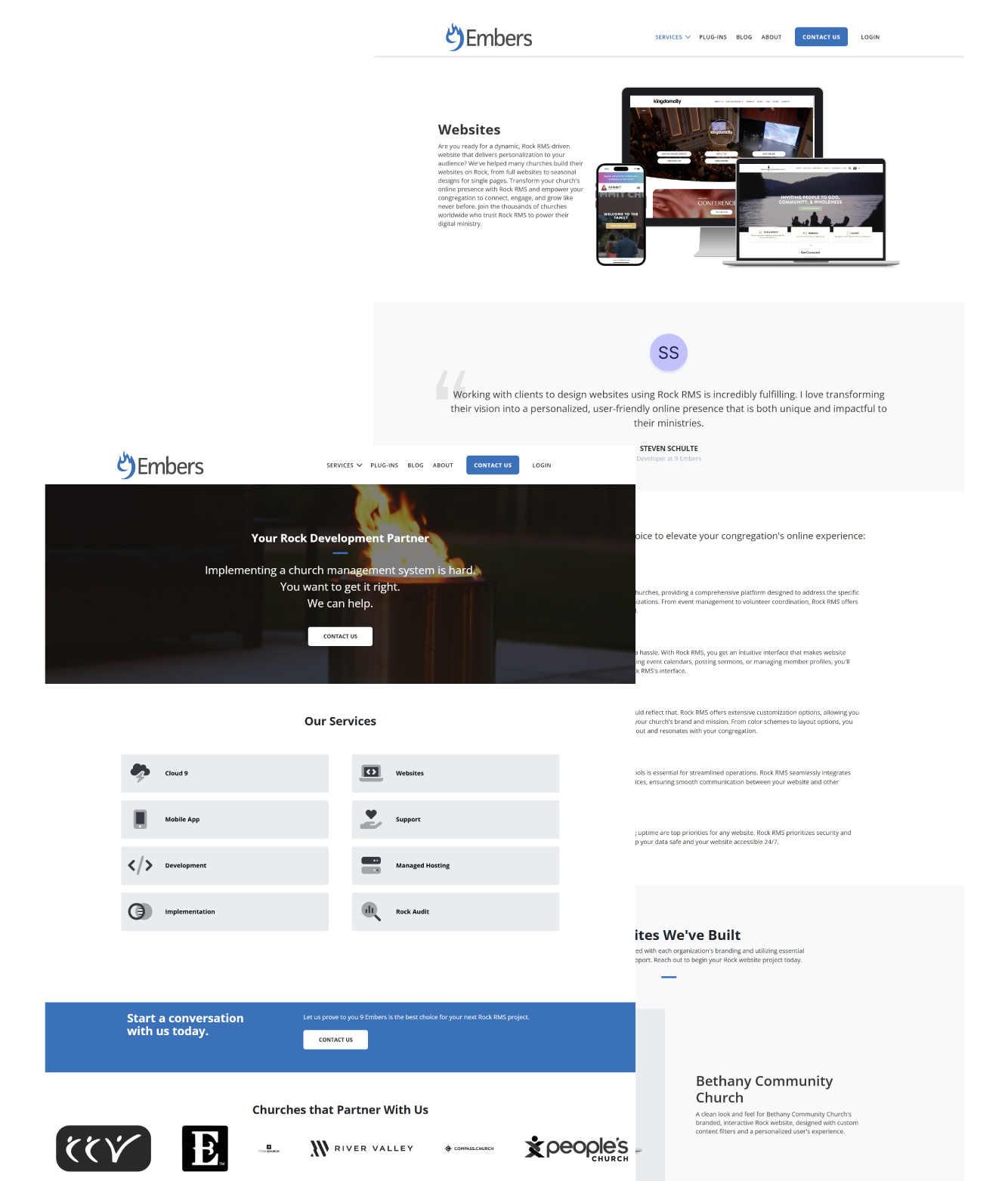
The website became the place to make 9 Embers easier to understand. Rather than leading with a list of services, I rewrote and redesigned the experience around the problems ministries are trying to solve. The new site uses clearer positioning, more specific language, and stronger pathways into services while keeping the focus on practical outcomes.The site was designed and developed in Rock CMS, giving the brand a working example of the platform and services 9 Embers supports.
Before
After